
Sommaire
Sage Green: the trendy 2026 decor color to adopt without mistake
Sage green is everywhere, from living room walls to kitchen fronts, because it brings something rare in decoration: a color that is present but never aggressive. This slightly grayish green perfectly matches the current mood, between the need for calm, a return to natural materials, and the search for visually more sustainable interiors. In 2026, it no longer just remains a pretty Pinterest shade: it becomes a real tool to structure a room, correct an overly cold atmosphere, or modernize furniture without a too obvious fashion effect. The result is that choosing the right shade, finish, and combinations makes all the difference.
🎨 Sage green is a soft grayish green, located between almond green, celadon, and certain eucalyptus shades. Its strength in 2026: it remains soothing, but appears more sophisticated than a simple beige or off-white.
🏡 It works particularly well in a living room, a bedroom, an entryway, or a kitchen, provided the shade is adapted to the light: lighter in a north-facing room, duller or grayer in a very bright room.
🪵 The best combinations remain materials and tones that balance its mineral side: light wood, off-white, greige, terracotta, brass, or even matte black in measured touches.
⚠️ The most frequent mistakes are well known: choosing a sage green that is too gray for a dark room, multiplying cold shades, or neglecting the paint finish between matte, velvet, and satin.
Why is sage green so appealing in 2026?
Sage green is popular in 2026 because it combines three strong expectations: a calm color, a natural appearance, and real decorative versatility. It warms more than a gray, remains more discreet than a bold green, and crosses styles without tiring quickly.
If this shade takes so much space in decor projects, it is not only because of its trendy aspect. It responds to a deeper evolution of interiors. After years dominated by cold white, contrasting black, and very minimalist palettes, many now seek more lived-in, more flexible, and less clinical spaces. Sage green precisely brings this balance: it maintains a neutral reading from a distance, but introduces a vegetal tone that adds depth.
Its success also lies in its adaptability. In a contemporary apartment with an open kitchen, it softens lines without breaking the impression of order. In an old house with moldings, it highlights volumes without falling into overly strict classicism. It works as well with a light oak floor as with more mineral materials, such as a beige zellige backsplash, softened travertine, or a stone-effect countertop.
Another reason for its lasting presence: this color fits into a more reasonable purchasing logic. A bright green sofa, a full terracotta kitchen, or a very graphic wallpaper can quickly date. Sage green, on the other hand, sits between decorative effect and neutral background. It therefore remains easier to keep over several years, which explains its status as a trendy decor color for 2026 without the impression of a gimmick.
How to choose the right shade of sage green according to the light?
To choose a sage green, you must first look at the room’s exposure. In the north, it’s better to opt for a light and slightly warm shade. In the south, a more grayish or deeper version works well. In any case, testing at different times of the day remains essential.
This is one of the least well-covered angles in competing content, even though it conditions almost everything. Sage green is not a fixed color: depending on the light, it can lean towards gray, khaki, celadon, or even an almost mineral green. In a north-facing room, where the light is often cooler, a sage green that is too gray can quickly seem dull. It is then better to choose a shade with a slightly warm base, close to a grayish almond green.
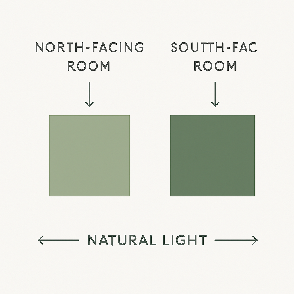
Conversely, a south-facing room receives more generous, sometimes golden light. This situation allows for a duller, smokier, or even slightly khaki sage green without losing clarity. In a through-living room, there is another way to succeed with the color: work the shade only on the least luminous wall to create visual depth without darkening the whole space.
The size of the room also matters. In an entrance of less than 6 to 8 m², a very grayish shade can weigh down the space if the joinery and ceiling are already dark. In a bedroom of 10 to 14 m², on the other hand, this enveloping aspect can become an asset, especially with ecru bedding and a light wood headboard. For those who want to avoid unpleasant surprises, sampling remains the most reliable method: paint an area of about 50 x 50 cm on two different walls and observe it in the morning, afternoon, and evening.
It is observed in practice that many disappointments come from a test done only under artificial light. A professional working on light renovation projects notes that the same sage green can seem elegant in the store but noticeably grayer once applied in a north-facing room.
The finish finally affects the result. A matte finish absorbs more light and gives a softer look, often very successful in a bedroom. A velvet or soft satin reflects a bit more light and is better suited for passage areas, especially a kitchen or hallway. Regarding indoor air quality, the label on VOC emissions remains a useful guide; Service-Public reminds the principle of labeling construction and decoration products, to check before purchase.
In which rooms does sage green work best?
Sage green has the rare advantage of performing well in several rooms, but not for the same reasons. In a living room, it mainly serves to calm the space and connect different materials. In a bedroom, it promotes a relaxing atmosphere. In a kitchen, it gives a more refined image than simple white, while remaining less risky than a very dark green. The key is therefore to think about the room according to its use, and not to replicate an inspiration seen elsewhere without adaptation.
In the living room, the safest formula is to use it on an accent wall, behind the sofa or around a bookshelf. With a beige sofa, an off-white rug, and some black touches, the result appears clean and contemporary. In a Haussmann-style living room or in a house with painted beams, sage green can also cover all the walls if the ceiling height exceeds about 2.50 m and if natural light remains sufficient.
In the bedroom, the color is particularly convincing on the headboard wall or on all four walls when the room is well lit. It pairs very well with washed linen textiles, a slightly warm off-white, and greige curtains. A family recently moved into a renovated house reported that switching from pearl gray to a light sage green immediately made the bedroom look less cold visually, without feeling overloaded.
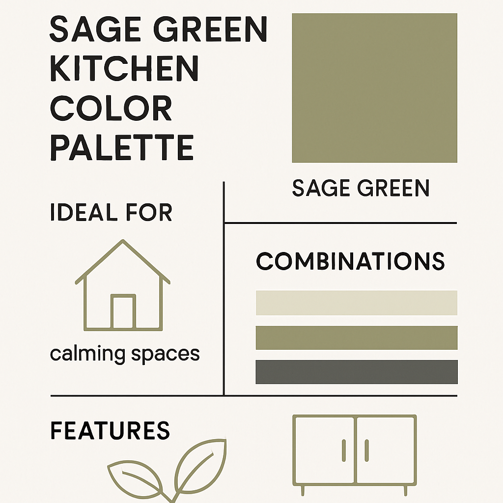
The sage green kitchen is one of the strongest uses for 2026. Matte or velvety fronts combined with a stone-look countertop and brass handles create an elegant yet accessible ensemble. Sage green works better than bottle green in small spaces, especially between 8 and 12 m², because it retains light. In a kitchen as in a laundry room, however, washable paint suitable for splashes should be favored.
The entryway and the office also constitute good application areas. In a narrow entryway, it creates an immediate identity. In a workspace, it softens the technical effect of screens and functional furniture. However, in a windowless bathroom, it must be handled with care: if it is too gray, the face may appear dull in the mirror, especially under cold LED lighting.
Which colors to pair with sage green for a balanced decor?
The most successful combinations with sage green are off-white, greige, light wood, soft terracotta, brass, and, in touches, matte black. The goal is not to turn everything green, but to create a measured and readable warm-cold contrast.
The great advantage of sage green lies in its status as a false neutral color. It accepts very varied combinations, but not all produce the same effect. With an off-white, it appears bright and sober. With a sand beige or a greige, it becomes more enveloping, almost mineral. With a powdered terracotta, it gains a more Mediterranean depth. And with details in brass, it takes on a more sophisticated tone.
For a very contemporary interior, the strongest combination often remains: sage green, warm white, light oak, and matte black as punctuation. This base works as well in a recent apartment in Lyon as in a suburban house near Bordeaux, as it adapts to several styles of floors and furniture. If you want a softer result, the duo of sage green and powder pink exists, but it requires restraint. Used in small touches on textiles or a lampshade, it brings delicacy. In too large a quantity, it can quickly appear decorative in the weaker sense of the term.
| Combination | Visual effect | Ideal room | Risk level |
|---|---|---|---|
| Sage green + off-white | Bright, timeless | Living room, entrance | Low |
| Sage green + light wood | Natural, warm | Bedroom, office | Low |
| Sage green + soft terracotta | Balanced warmth | Living room, kitchen | Medium |
| Sage green + brass | Chic, refined | Kitchen, bathroom | Low to medium |
| Sage green + matte black | Graphic, contemporary | Kitchen, entrance | Medium |
| Sage green + cool gray | Very mineral, sometimes dull | Large bright rooms | High |
A point often forgotten: metals and textiles count as much as paint. A brushed brass light fixture, a mirror with a thin black frame, natural linen curtains, or an ecru rug can stabilize a palette better than a simple wall reminder. According to ADEME, the perceived quality of an interior also depends on the overall coherence of the layouts and materials, which aligns with a field reality: color alone does not create the atmosphere.
Sage green, celadon, eucalyptus, khaki: what are the differences?
These shades are often confused even though they do not produce the same effect in a room at all. Sage green is generally located at the intersection of green and gray, with a felted, natural, and calm appearance. Celadon leans more clearly towards a powdery and luminous sensation, sometimes slightly bluish. Eucalyptus appears fresher, more vegetal, sometimes more modern. Khaki, on the other hand, is denser, earthier, and much more assertive.
For a small or medium-sized room, sage green often remains the best compromise. Celadon may lack presence in a large living room. Khaki can darken a modestly sized bedroom. Eucalyptus, very attractive in images, sometimes becomes cold in insufficient light. That is why visual comparison between color charts is crucial before making a decision, especially when the paint must cover a large volume or an imposing piece of furniture.
The real asset of sage green is not to be spectacular. It is precisely to remain elegant when trends pass, which very few decorative colors can do.
For those who also work with color on screen, it is important to keep in mind that an approximate hex code for sage green can hover around a light gray-green, but digital display is never enough to choose paint. Texture, reflectance, and real light profoundly alter the result. According to ANSES and its work on indoor air, the choice of coverings and decorative products is not limited to aesthetics; their composition and use also influence the comfort of the home.
Sage green paint: which finishes and which mistakes to avoid?
The best finish depends on the surface: matte for a bedroom or a well-prepared ceiling, velvet for a living room, satin for a kitchen or hallway. The most common mistake is choosing a shade that is too cold or too gray for a room that is already poorly lit.
A successful project does not rely solely on the right shade. The finish determines how light circulates and how surface imperfections appear. Matte remains superb on a smooth wall, but it marks more easily and withstands repeated rubbing less well. Velvet often constitutes the best compromise in living spaces: elegant appearance, reasonable maintenance, moderate light reflection. Satin, finally, holds up better in high-traffic areas but reveals wall irregularities more.
In practice, four mistakes often recur:
- Choosing only on screen: the rendering of a grayish shade varies enormously depending on lighting and surface.
- Forgetting the environment: cold floors, gray woodwork, and metallic furniture can make the whole too austere.
- Painting the entire room without contrast: ceiling, woodwork, and walls of the same intensity sometimes crush the volumes.
- Ignoring actual use: a finish that is too fragile in a kitchen or entrance quickly degrades visually.
An agent observes that the most convincing projects rarely use sage green alone. In practice, inhabitants who achieve the best results almost always add a warm counterpoint: honey wood, mineral beige, ecru textiles, or brushed brass accessories.
For a piece of furniture, an interior door, or woodwork, sage green can be bolder than on walls, precisely because the surface is limited. A dresser, a china cabinet, or a painted baseboard allows testing the color without committing the entire room. It is also a good strategy in older homes, where volumes call for personality but where one wants to avoid heavy renovation.
How to incorporate sage green without repainting the entire house?
The easiest way to adopt sage green without major work is to introduce it in small amounts: bedding, curtains, repainted furniture, ceramics, buffet facade, or headboard. The effect is visible but reversible if you want to adjust the palette.
Not everyone wants to bring out the rollers. Good news: sage green works very well in targeted touches. An armchair, a bench, thick cushions, a textured throw, or heavy curtains can already establish the color. This type of integration is particularly suitable for renters or people testing a new decorative universe before painting.
You can also go through furniture. A vintage buffet, an entry console, mismatched chairs, or a small dining room piece repainted in sage green transform the atmosphere without a big budget. This approach works well in a living room dominated by neutral tones. It also allows linking furniture of different styles by creating a common chromatic point.
Finally, sage green expresses itself well through useful details: dishes, lampshades, plant pot covers, transitional adhesive backsplashes, table linens, or upholstered headboards. In an interior already beige, ecru, or sandy, these additions are often enough to shift the room towards a more current aesthetic without overloading the decor. For those who want to go further, there is another way to create a 2026 effect: combine sage green with a textured material, such as grained wood, cane, or matte artisanal ceramics.
FAQ about sage green
Is sage green suitable for a small room?
Yes, provided you choose a light to medium shade and keep bright elements around, like a warm white ceiling or ecru curtains. In a room smaller than 9 m², it is better to avoid versions that are too gray or too khaki.
Is sage green suitable for a modern interior?
Absolutely. With matte black, simple lines, and some natural materials, it delivers a very current result. It is often even more subtle than concrete gray or pure white, sometimes considered too cold in 2026.
Can sage green be used in a bathroom?
Yes, especially if the bathroom receives natural light. Without a window, it is best to favor a less gray version and lighting around 2700 to 3000 K to avoid a too cold rendering on the face and materials.
Which color should be avoided with sage green?
The main risk comes from a combination of cold grays and very dull blues, which can make the whole look dull. It is better to bring at least one warm component, for example beige, blond wood, or a soft terracotta.
Sage green and kitchen: lasting trend or fad?
On a kitchen, this shade has a good chance to last, precisely because it is neither too bright nor too dark. Sage green facades with a light countertop remain easy to update afterwards with handles, lighting, or backsplash.
Does sage green work with dark wood?
Yes, but the contrast becomes more sophisticated and a bit more classic. On walnut or smoked oak, sage green gains depth; you then need to ensure enough light and some light surfaces to avoid darkening the room.