
Sommaire
Terracotta: Trendy Color Decoration 2026
Terracotta is making a comeback in interiors, but in 2026 it is no longer just a simple orange wall. The trend is evolving towards more subtle shades, between rosy clay, soft brick, and mineral terracotta, with a real challenge: choosing the right undertone to avoid an effect that is too dark or too dated. In living rooms, bedrooms, kitchens, and even facades, this warm color changes significantly depending on the light, materials, and finish. The result is that a successful interior depends not only on the chosen shade but also on its dosage, combinations, and use room by room.
🎨 The terracotta 2026 comes in several families: rosy, ochre, brick, and spiced brown. The right choice mainly depends on brightness, orientation, and the desired style.
🛋️ In decoration, it works particularly well with off-white, linen, sage green, light wood, walnut, and certain deep blues. These combinations avoid a monotonous effect.
🏠 In practice, the color gives good results on a wall section, textiles, terracotta-effect tiles, or handcrafted objects. In a total look, it requires a well-exposed room and an appropriate finish.
🌿 For a painting project, it is better to favor products with low emissions, ventilate after application, and test the shade at several times of the day. Perception varies greatly between morning, afternoon, and artificial lighting.
What exactly is the color terracotta?
Terracotta refers both to a family of colors inspired by terracotta and, originally, a material. In decoration, it lies between orange, red, dusty pink, ochre, and brown, with more or less sunny or mineral nuances.
The word comes from the Italian terra cotta, literally baked earth. This origin explains why the shade evokes both craftsmanship, Mediterranean architecture, clay pots, and certain mineral plasters. In the world of decoration, terracotta is therefore not a single color but a palette, ranging from a reddish sand tone to a deeper brick shade.
This clarification is important because many disappointments come from a misunderstanding: people think they are buying “terracotta,” whereas they are actually choosing between a rosy, orange, browned, or ochre terracotta. In a north-facing room, a shade that is too brown can quickly appear dull. Conversely, in a very bright south-facing living room, a slightly rosy terracotta often brings more softness than a saturated brick tone.
In 2026, the trend leans towards more natural and less garish versions. Terracotta works because it warms up an interior without falling into bright yellow, while maintaining a depth that beiges do not always have. It is also a response to the return of authentic materials: washed linen, travertine, light oak, walnut, artisanal ceramics, or zellige.
Why does terracotta remain a strong decor color in 2026?
In 2026, terracotta remains trendy because it combines three strong expectations: visual warmth, natural aspect, and versatility. It modernizes a minimalist interior, warms neutral decors, and easily pairs with artisanal materials that are very present in current trends.
The success of terracotta is first explained by the decorative context. For several seasons, interiors have moved away from cold white and very marked grays to return to more enveloping tones. Terracotta perfectly meets this search for visual comfort. It brings an immediate sensation of warmth without requiring a heavy decoration. A simple wall, a few cushions, or a backsplash are often enough to change the atmosphere.
There is another way to understand its popularity: this color links several styles. In a Mediterranean decor, it recalls tinted lime and pottery. In a contemporary setting, it contrasts with clean lines and black furniture. In a bohemian interior, it dialogues with natural fibers, caning, and off-white rugs. This transversal character gives it real longevity.
Terracotta is no longer just a “crush” color: it has become a structural shade, capable of organizing an entire ambiance without overwhelming the space when well dosed.
Moreover, concerns related to indoor air quality also influence decor choices. According to the ADEME, airing after work and choosing suitable products remain essential to limit exposure to domestic pollutants. Regarding paint, the labeling of volatile pollutant emissions in indoor air is a useful reference, especially for a bedroom or a child’s room. The 2026 trendy terracotta is therefore not just a matter of style: it also fits into a more thoughtful approach to materials.
How to choose the right shade of terracotta according to the room?
To properly choose a terracotta, you need to consider three criteria: the room’s orientation, the size of the space, and the desired effect. A pinkish terracotta suits small, poorly lit rooms better, while a brick or ochre tone holds up better in a large, well-exposed volume.
The first variable is natural light. A north-facing room receives cooler light; it better supports a light terracotta, slightly pinkish or softened with beige. In a room exposed to the south or west, more intense shades gain relief without becoming dull. This is where tones close to brick, fired clay, or red ochre become particularly interesting.
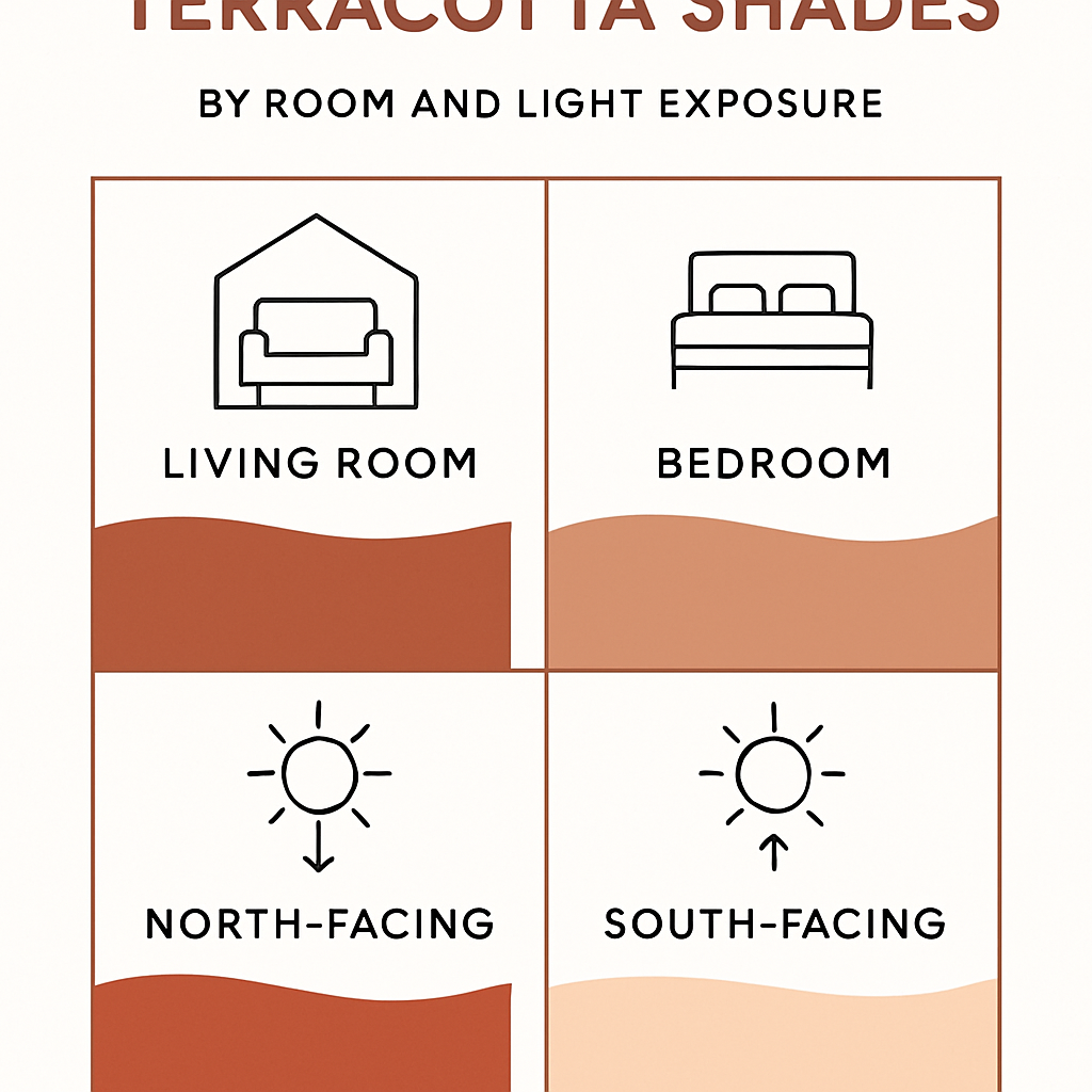
The second variable is the function of the room. In a living room, terracotta often serves as an anchoring color: a wall behind the sofa, an alcove, a bookshelf, or a baseboard. In a bedroom, powdered versions create a more restful effect. In the kitchen, earthy undertones work well with wood and stone, especially on a backsplash, wall tiles, or occasional fronts. For a bathroom, it is better to stick to bright variants, especially if the room has no window.
The following table helps to visualize the most coherent uses.
| Terracotta Shade | Ideal Rooms | Visual Effect | Recommended Combinations |
|---|---|---|---|
| Pinkish Terracotta | Bedroom, entrance, small room | Soft, bright, powdery | Off-white, linen, brass, light wood |
| Ochre Terracotta | Living room, kitchen, office | Warm, sunny, natural | Sage green, travertine, beige, ceramic |
| Brick Terracotta | Large living room, accent wall | Dense, structuring, enveloping | Walnut, matte black, cream, petrol blue |
| Spiced Brown Terracotta | Library, headboard, niche | Intimate, sophisticated, muffled | Khaki, ecru, bronze, thick textile |
In practice, residents mostly regret two mistakes: choosing a shade that is too dark on four walls in a small room, or selecting a terracotta that is too orange under cold white artificial lighting. An interior decoration agent notes that tests carried out on at least 50 x 50 cm and viewed at different times of the day avoid a large part of poor choices. This test seems simple, but it remains much more reliable than a small paper sample.
It is observed in the field that terracotta often appeals at first glance in the store, then seems darker once applied at home. A family who recently repainted a living room reports having changed the shade after testing, because the initially planned brick version absorbed too much evening light.
With which colors to pair terracotta for a balanced interior?
The best combinations with terracotta are off-white, beige, linen, sage green, khaki, wood, and certain deep blues. These combinations preserve its warmth while avoiding a result that is too heavy or too monotonous.
The simplest duo remains terracotta and warm neutrals. With pure white, the contrast can be very sharp, sometimes a bit harsh. With off-white, ivory, or sandy beige, the color appears more sophisticated and easier to live with. This type of pairing works well in contemporary apartments, especially when the floor is light parquet or beige porcelain stoneware.
Sage green and khaki form another very effective pair. They extend the idea of nature without falling into a total Mediterranean look. In a kitchen, for example, sage green fronts with a terracotta backsplash can produce a very balanced result. For those who want a denser atmosphere, petrol blue or ink blue create an elegant contrast, provided they are used in touches.
Materials play a role at least as important as colors. Terracotta likes:
- light oak for a soft and bright atmosphere;
- walnut for a more chic and graphic effect;
- beige stone, travertine, or mineral plaster for an authentic look;
- matte black in small amounts to structure the space;
- natural fibers such as linen, jute, or rattan.
Conversely, some combinations require more caution. A terracotta already very orange with a strong yellow can quickly become tiring. Likewise, a combination of dark brown, brick red, and warm lighting can compress the room. The right reflex is to preserve a light base around the strong color.
Paint, tiles, textiles: where to use terracotta in 2026?
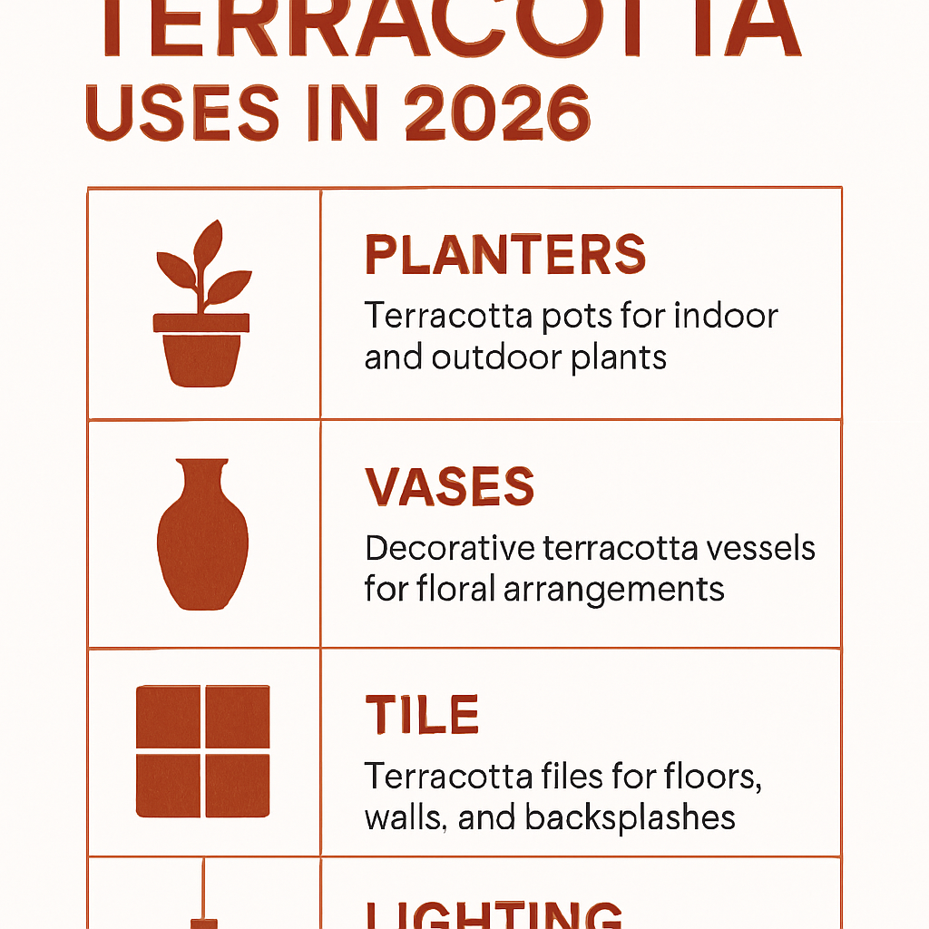
Terracotta is no longer limited to walls. In 2026, it also expresses itself on terracotta-effect tiles, textiles, lampshades, matte velvet sofas, ceramics, pendant lights, and some accent furniture. This diversity explains its lasting comeback: everyone can adopt it according to their budget and level of decorative commitment.
Paint remains the most accessible entry point. On a wall section, it generally costs less than changing furniture and immediately transforms the perception of the space. For a finish, matte gives a powdery and soft appearance, velvet softens imperfections while reflecting some light, and satin is better suited for high-traffic areas like a kitchen or hallway. In an open kitchen, a terracotta wainscot or a colored niche may be enough to create a visual link with the living room.
Tiles and terracotta-effect coverings are also appealing because they extend the connection with the original material. They are found in kitchens, patios, entrances, or bathrooms. As a guideline, decorative formats for backsplashes or walls often come in modules of about 5 x 5 cm, 10 x 10 cm, or 13 x 13 cm, while terracotta-effect floor tiles frequently reach 30 x 30 cm or larger depending on the collections. The finish is more authentic when the surface is not perfectly uniform.
For a more flexible use, textiles are an excellent entry point. A beige sofa can be warmed up by two terracotta cushions, a boucle wool throw, and an off-white rug with brick patterns. This approach is particularly suitable for renters or those who want to test the trend without repainting. In a Haussmann-style apartment, this color can interact with white moldings; in a more contemporary house, it works very well with a black window frame and light polished concrete.
When it comes to renovation, caution remains useful. According to the Anses, indoor air is influenced by many everyday materials and products. For those renovating an entire room, it is better to combine aesthetic choices with vigilance regarding emissions, then ventilate widely in the days following the work. In the same logic, the recommendations of the ADEME on home ventilation remain fully relevant after painting.
What mistakes should be avoided with terracotta?
The most common mistakes with terracotta are a shade not suited to the lighting, using it on too many dark surfaces, a poor choice of finish, and overly busy combinations. The color should warm the room, not weigh it down.
The first mistake is confusing intensity with character. Many think a darker shade will be more elegant. In reality, in a medium-sized room, a terracotta that is too dense can visually bring the walls closer and reduce the feeling of space. This is especially true in a narrow entrance, a poorly lit office, or a bedroom with few openings.
The second mistake: forgetting artificial lighting. Under very cold LED light, some terracotta shades lean towards bright orange or lose their subtlety. It is therefore useful to check the appearance in the evening, not just during the day. A bulb around 2,700 to 3,000 K generally gives a more consistent rendering with the spirit of this color in a living space, although the exact choice depends on the uses.
The third mistake: trying to match all materials. A terracotta wall, a rust-colored rug, a brown sofa, ochre curtains, and golden light fixtures can produce an overloaded ensemble. Terracotta works better when it interacts with breathing spaces: a light ceiling, large off-white textiles, simple woodwork, a natural wood table, or beige stone.
An agent observes that the most convincing projects are not necessarily those that use the most terracotta, but those that place it in the right spot. In a living room, a single well-chosen wall or a large colored headboard often gives a more lasting result than a total look decided too quickly.
Finally, one must consider maintenance and actual use. A very matte finish is superb in a living room but less suitable for a frequently used hallway. In the kitchen, washable paint or a more resistant wall covering may be preferable. Again, the 2026 trend favors measured choices, with colors thought out in their usage context rather than applied as a mere fashion effect.
Terracotta 2026: what inspirations according to decoration styles?
Terracotta is flexible enough to fit into very different registers. In a Mediterranean style, it pairs with textured walls, travertine, arches, light wood, and artisanal ceramics. Cities like Marrakech, Seville, or some houses in Provence strongly feed this imagery, with visual references that remain very influential in interior decoration.
In a contemporary interior, terracotta benefits from being framed by clean lines: low sofa, black pendant light, stone table, thick linen curtains. It then becomes a contrasting color, less folkloric and more architectural. This register suits recent apartments with open kitchens and streamlined volumes.
In a boho chic version, it mixes with natural materials, baskets, rattan, and woven textiles. To avoid clichés, it is better to limit patterns and focus on more sober objects. A large jar, a light bench, and a few cushions often suffice to set the mood. Finally, in a Japandi style, the duller variants of terracotta create an interesting link with light wood, greige, and matte ceramics.
FAQ on terracotta in decoration
Is terracotta suitable for a small room?
Yes, provided you choose a light or pinkish shade and limit its use to one wall, a niche, or a few accessories. In a room smaller than 10 to 12 m², a terracotta that is too brown on all walls can quickly reduce the feeling of space.
Can terracotta be used in a bedroom?
Yes, and it is even one of the most convincing uses. For a restful atmosphere, it is better to favor a powdered terracotta, paired with off-white bedding, light wood, and warm lighting rather than a very brick version.
Is terracotta suitable for modern decor?
Absolutely. In a modern setting, it works very well with clean lines, matte black, smoked glass, or light concrete. The key is to use it as a structural accent rather than as an omnipresent color.
Which finish should you choose for terracotta paint?
Matte is often the most elegant in a living room or bedroom, as it gives a powdery look. Velvet is a good compromise, while satin is more practical in a kitchen, entrance, or hallway.
Does terracotta work without natural wood?
Yes. Even though wood suits it very well, terracotta can also be paired with black metal, aged brass, beige stone, or cream lacquered furniture. The essential thing is to maintain a rather warm and not too numerous supporting palette.
How to test terracotta before repainting?
The most reliable method is to paint an area of at least 50 x 50 cm on the concerned wall, then observe it in the morning, afternoon, and evening. A paper swatch or a small pot placed randomly is not enough to anticipate the real effect.